“Cookies par Marie” is a passionate and authentic Montpellier company specializing in the production and sale of cookies and shortbread.
Above all, the company aims to convey a local, quality image. All its products come from the Occitanie region and are produced in a short circuit, guaranteeing customers an image of quality and product traceability.
As part of a school project, I redefined the store's visual identity with a new logo, a refresh of the existing color palette, as well as stationery to help develop Marie's growing business.
The logo is divided into three distinct parts:
On the one hand, the upper typography is intended to represent an idea of elegance. This idea is particularly evident in the “Cookies par Marie” boutique, which has a refined, decorative feel, while retaining an overall idea of elegance and refinement.
On the other hand, the lower typography represents an artisanal, handmade feel. Indeed, this association of ideas is present to recall the artisanal side that governs Marie-Amélie's cookie and shortbread making.
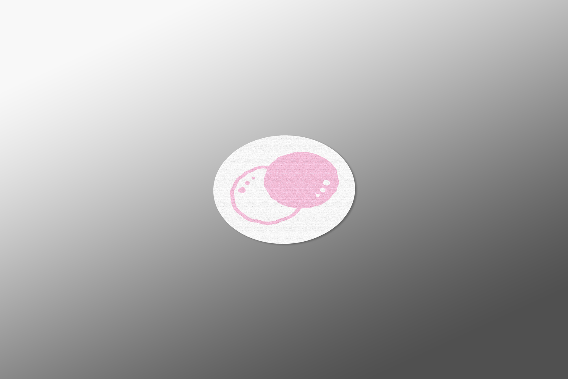
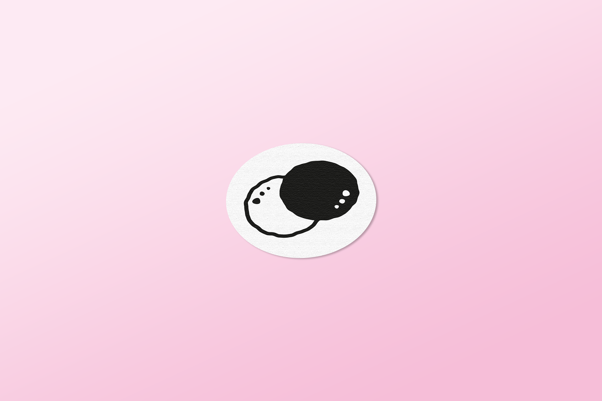
Finally, the two circles representing the “O” in the word “cookies” echo the shape of the cookies and sablés sold in the boutique.
The dots inside the circles refer to the crumbs left on the table when a cookie is eaten, but also to the nuggets found in some cookies, making for an interesting association of ideas.
The dots inside the circles refer to the crumbs left on the table when a cookie is eaten, but also to the nuggets found in some cookies, making for an interesting association of ideas.
