Some time ago, I decided to imagine what the new logo of the city I live in might look like.
Starting with this idea, I developed the project to the point of creating a graphic universe so that the name of the city of Sète would not only be the name of a town, but an icon of the region.
Before I let you discover the project I enjoyed so much, I'd like to make it clear that all rights to the project and to the use of the image belong entirely to the Ville de Sète.
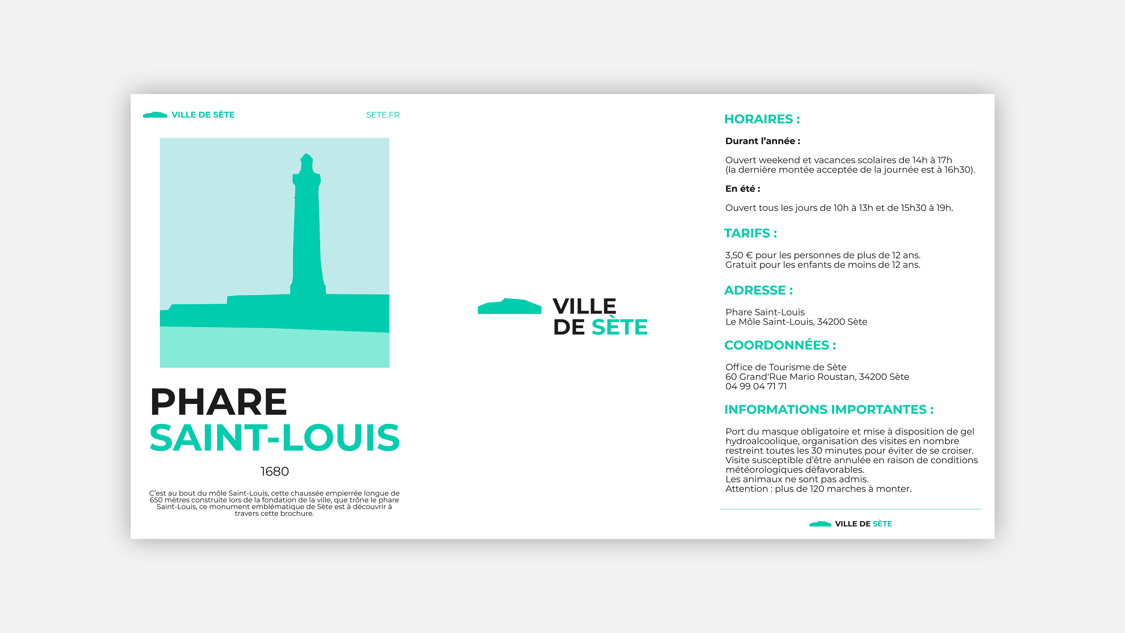
Alongside the logo, a branding system has been developed for all the city's tourist attractions.
The idea here is to link the city's major landmarks to the city itself, creating links in particular through the graphic identity.
The idea here is to link the city's major landmarks to the city itself, creating links in particular through the graphic identity.
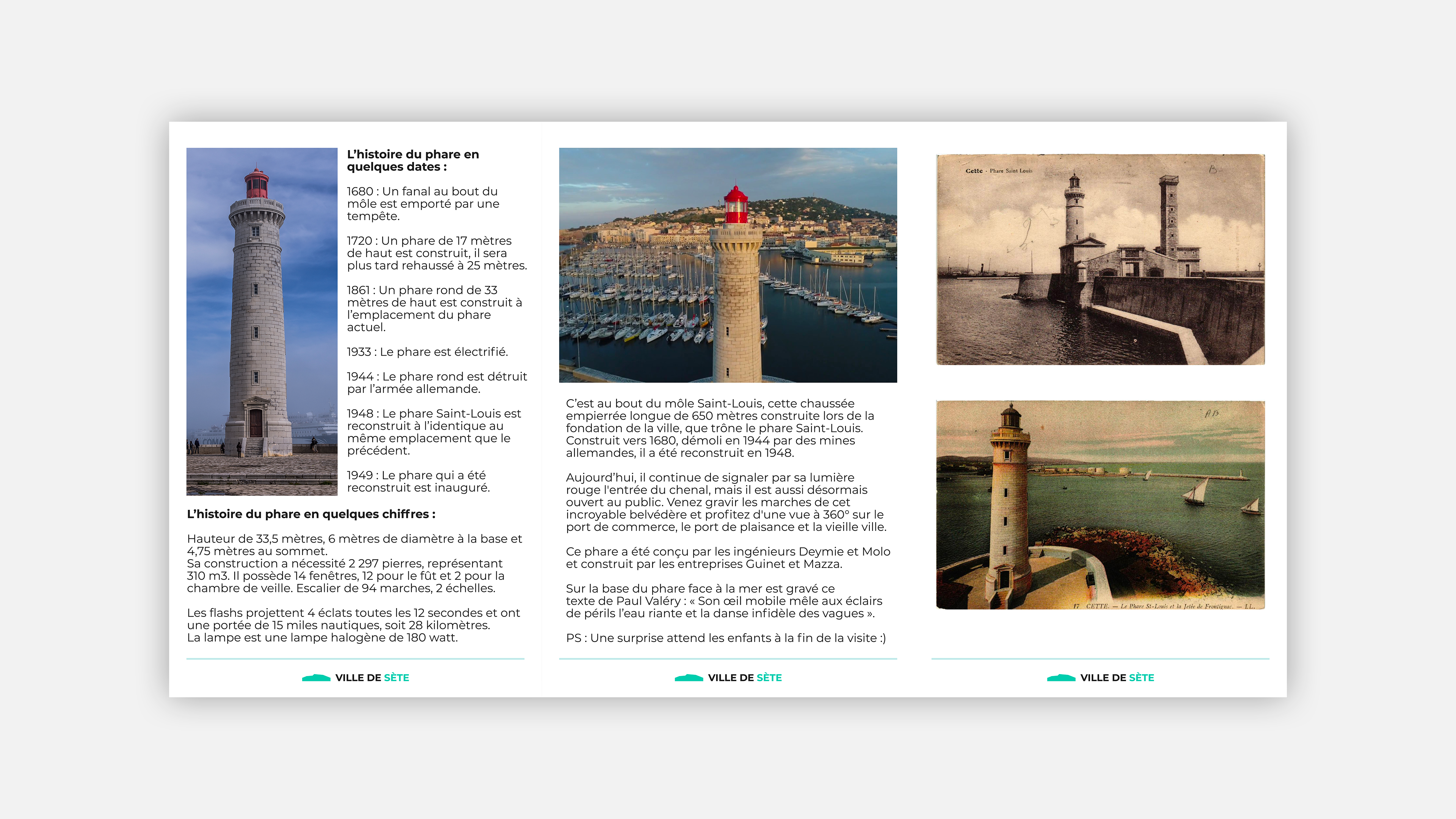
These variations have been designed to create a real cohesion between each part of the city, and can be found on a number of elements, such as brochures, billboards, or even on the site itself, for example by installing a wall plaque at tourist attractions.
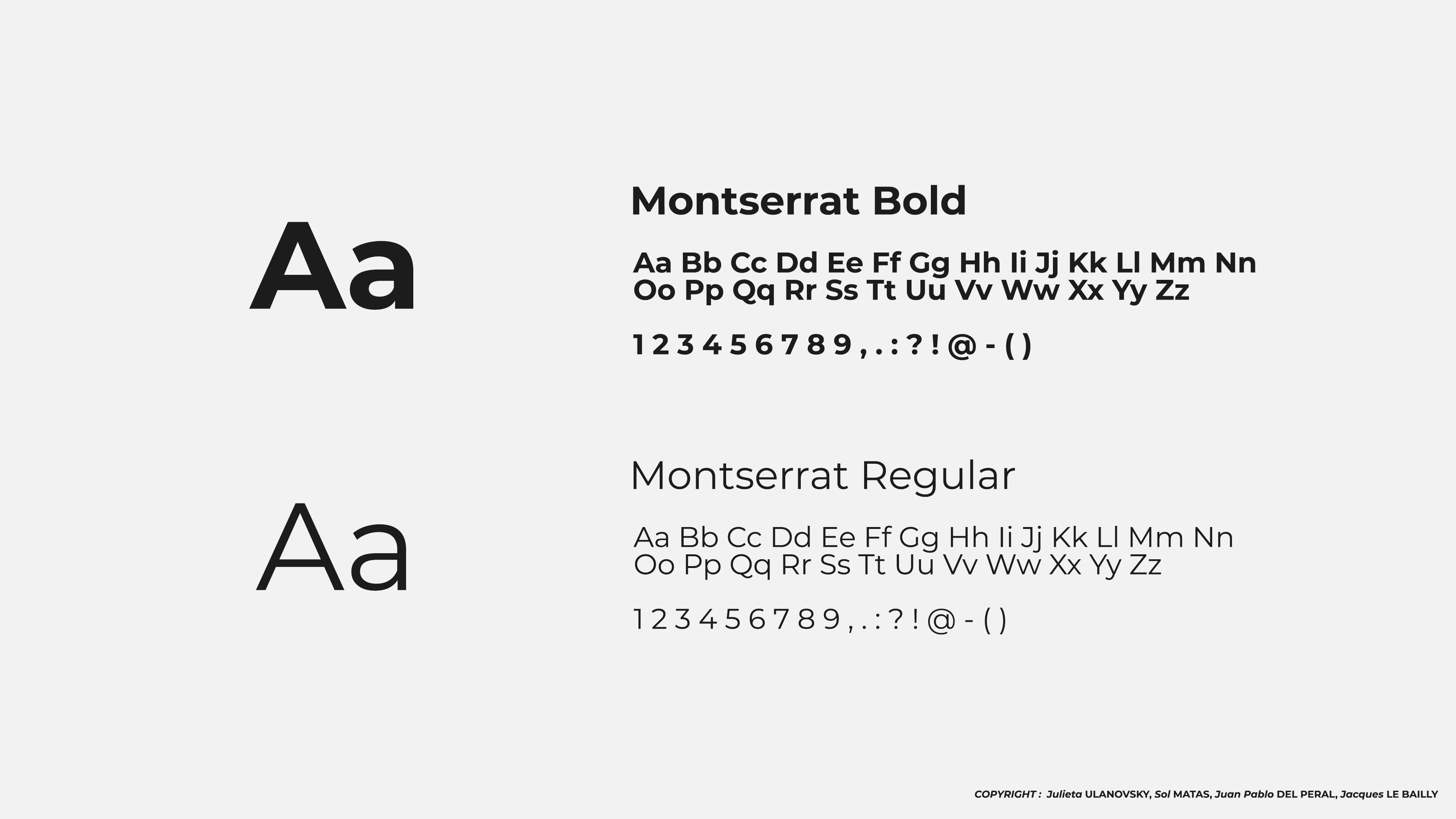
The Montserrat font was used, with Bold and Regular variations of the typeface chosen to play on the different widths of the font to give a little more relief to the visuals and texts.
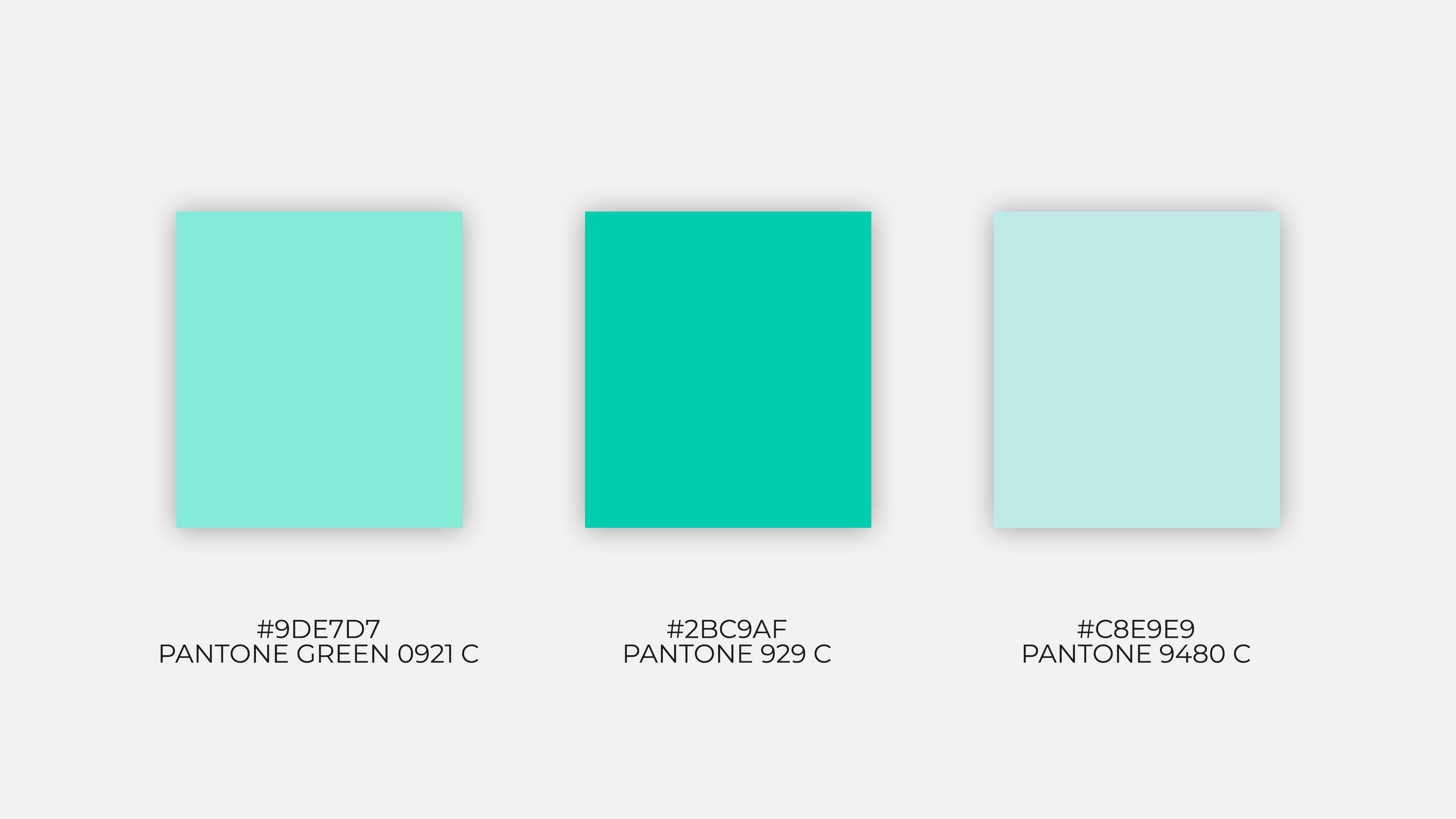
As for the color palette used, the three colors are in continuity with the green color on the logo, and were designed to bring a sort of liveliness to the city.
